
Three views are available for the AppFlow Monitor: List View, Pie Chart View, and Flow Chart View. Each view provides a unique display of incoming, real-time data.
In the List View, each AppFlow tab comprises columns displaying real-time data. These columns are organized into sortable categories. Some columns are common to all tabs.The VoIP tab, however, also has columns specific to it. There are tooltips and flow tables associated with some column items.
|
Allows the selection of the line item for creation of filters and rules. |
|
|
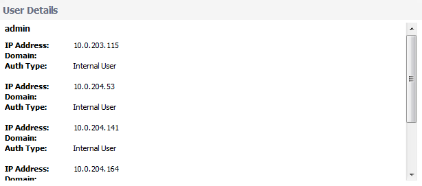
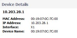
The title of the Main Column depends on the selected tab. For example, if the Users tab is selected, then the Main Column header is Users and the column lists the names of users connected to the network. Clicking on an item in this column displays a tooltip with relevant information on the item; see Detail Tooltips . |
|
|
Displays the number of sessions associated with the item in the Main Column. Clicking on this number displays a Flow Table of all the sessions. |
|
|
Displays the number of threats encountered by the network per item. |
|
|
Displays, at the bottom of the list, the total Items listed, Sessions, Total Packets, and Total Bytes sent during the duration of the current interval. |
|
Displays the number of packets either out of sequence or lost per item. |
|
|
Displays the average jitter rate, in milliseconds, per item. |
|
|
Displays the maximum jitter rate, in milliseconds, per item. |
You can select which columns to display for each of the tabs.
|
1
|

|
|
|||||||
|
|
|
||||||
|
|
|||||||
|
3
|
Click Save.
|
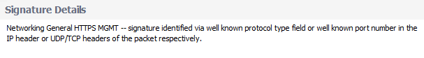
Each item listed in the Main Column provides a link to a Detail tooltip, which appears when an item link is clicked. The information provided by the tooltip depends on the tab. For example, clicking on an Application column item in the Applications tab displays a Signature Details tooltip, while clicking on a User column item in the Users tab displays a User Details tooltip.
![]()
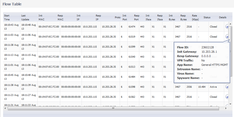
Each item in the Sessions column contains a link to a Flow Table containing relevant information on that session/flow:
The Flow Table appears when a link is clicked. Further information can be obtained by hovering the cursor over the Statistics icon in the Details column. Doing so displays a tooltip containing:
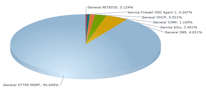
The Pie Chart View displays the number of top items and the percentage of bandwidth used by each. The percentage of bandwidth used is determined by taking the total amount of bandwidth used by the top items and then dividing that total by the number of items.
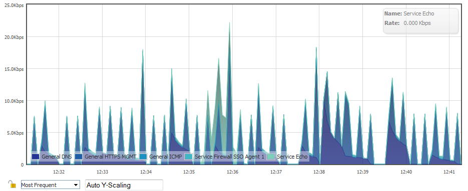
The Flow Chart View displays the network usage according to the Kbps used over the specified period. For each AppFlow Monitor tab, you can select, in the:
|
•
|
Most Frequent—The top entries in the AppFlow Monitor tab.
|
|
NOTE: The most frequent entries may change over time. If you select Most Frequent, you can restrict the most frequent entries to those displayed at a particular time by clicking the Lock icon next to the drop-down menu.
|
|
•
|
Auto Y-Scaling (default).
|