Dashboard_RealTimeMonitor
Dashboard > Real-Time Monitor
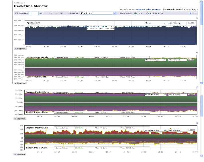
The Real-Time Monitor provides administrators an inclusive, multi-functional display with information about applications, bandwidth usage, packet rate, packet size, connection rate, connection count, multi-core monitoring, and memory usage.
This section contains the following subsections:
• Using the Toolbar
• Applications Monitor
• Ingress and Egress Bandwidth Flow
• Packet Rate Monitor
• Packet Size Monitor
• Connection Count Monitor
• Multi-Core Monitor Flow
Using the Toolbar
The Real-Time Monitor Toolbar contains features to specify the refresh rate, export details, configure color palettes, change the amount of data displayed, and pause or play the data flow. Changes made to the toolbar apply across all the data flows.
|
Option
|
Widget
|
Description
|
|
Refresh rate
|
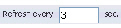
|
Determines the frequency at which data is refreshed. A numerical integer between 1 to 10 seconds is required. One second is the default.
|
|
Export
|

|
Exports the data flow into a comma separated variable (.csv) file. The default file name is sonicflow.csv.
|
|
Configure
|

|
Allows for customization of the color palette for the Application Chart and Bandwidth Chart.
To customize the Color Palette:
Enter the desired hexadecimal color codes in the provided text fields.
• Select Default for a default range of colors.
• Select Generate to generate a random range of colors.
If a gradient is desired, select the Use Gradient box located below the text fields.
|
|
View Range
|
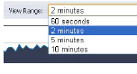
|
Displays data pertaining to a specific span of time. Two minutes is the default setting for the view range.
|
|
Time & Date
|

|
Displays the current time in 24-hour format (hh:mm:ss), and the current date in Month/Day format.
|
|
Pause
|

|
Freezes the data flow. The time and date will also freeze.
The Pause button will appear gray if the data flow has been frozen.
|
|
Play
|

|
Unfreezes the data flow. The time and date will refresh as soon as the data flow is updated.
The Play button will appear gray if the data flow is live.
|
|
Applications Monitor
The Applications data flow, which is disabled by default, provides a visual representation of the current applications accessing the network.

Options are available to Display, Scale, and View the Application interface.
|
Option
|
Widget
|
Description
|
|
Lock
|

|
Locks the Display options for the Application interface. The lock and unlock option is available when you select “Most Frequent Apps.” Most Frequent Apps displays the top-25 apps, you can use the lock or unlock option to keep the report from altering the top-25 apps.
|
|
Unlock
|

|
Unlock the Display options for the Application interface.
|
|
Application Display
|
|
Specifies the applications displayed in the Application Flow Chart.
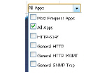
A drop menu allows the administrator to specify Most Frequent Apps, All Apps, or individual applications. If desired, multiple applications can be selected by clicking more than one check box.
|
|
Scale
|

|
Allows for Auto Y-Scaling or customized scaling of the Application Flow Chart.
The values for customized scaling must be a numeric integer. Specifying a unit is optional. If a unit is desired, these are the available options:
• K for Kilo.
• M for Mega.
• G for Giga.
• % for percentage.
If a custom scale of 100Kbps is desired, then “100K” should be entered. The numeric integer 100 is entered followed by the unit K.
|
|
Bar Graph
|

|
Displays the Applications data in a bar graph format.
|
|
Flow Chart
|

|
Displays the Applications data in a flow chart format.
|
|
Available Formats
Administrators are able to view the Application flow charts in a bar graph format or flow chart format. The bar graph format displays applications individually, allowing administrators to compare applications. In this graph, the x-axis displays the name of the applications. The y-axis displays the amount of traffic for each application. The following example is a “Flow Chart” view.
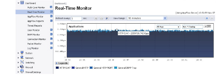
The flow chart format displays over lapping application data. In this graph, the x-axis displays the current time and the y-axis displays the traffic for each application. The following example is a “Bar Chart” view.
Ingress and Egress Bandwidth Flow
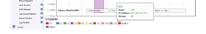
The Ingress and Egress Bandwidth data flow provides a visual representation of incoming and outgoing bandwidth traffic. The current percentage of total bandwidth used, average flow of bandwidth traffic, and the minimum and maximum amount of traffic that has gone through each interface is available in the display. Administrators are able to view the Ingress and Egress Bandwidth flow chart in a bar graph format or flow chart format.
The bar graph format displays data pertaining to individual interfaces in a bar graph; allowing administrators to compare individual Bandwidth Interfaces. In this graph, the x-axis denotes the Interfaces whereas the y-axis denotes the Ingress and Egress Bandwidth traffic.
The flow chart format overlaps the Bandwidth Interfaces; allowing administrators to view all of the Ingress and Egress Bandwidth traffic as it occurs. The x-axis displays the current time and the y-axis displays the Ingress and Egress Bandwidth traffic.
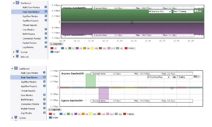
Options are available to customize the Display, Scale, and View of the Ingress and Egress Bandwidth interface.
|
Option
|
Widget
|
Description
|
|
Interface Rate Display
|
|
Specifies which Interfaces are displayed in the Bandwidth Flow Chart.
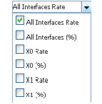
A drop menu provides the administrator with options to specify All Interfaces Rate, All Interfaces, and individual interfaces.
The individual interfaces vary depending on the number of interfaces on the administrator’s network. Multiple interfaces can be selected if desired.
|
|
Scale
|

|
Allows for Auto Y-Scaling or custom scaling of the Bandwidth Flow Chart.
The values for customized scaling must be a numeric integer. Specifying a unit is optional. If a unit is desired, four options are available:
• K for Kilo.
• M for Mega.
• G for Giga.
• % for percentage.
If a custom scale of 100Kbps is desired, then “100K” should be entered. The numeric integer 100 is entered followed by the unit K.
|
|
Bar Graph Format
|

|
Displays the real-time Bandwidth data in a bar graph format.
|
|
Flow Chart Format
|

|
Displays the real-time Bandwidth data in a flow chart format.
|
|
Tooltips
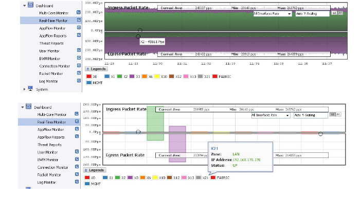
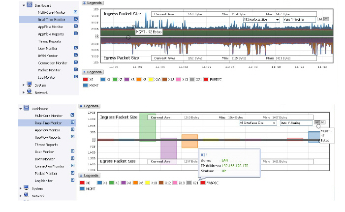
Rolling over the interfaces provides tooltips with information about the interface assigned zone, IP address, and current port status.
Note The Bandwidth flow charts have no direct correlation to the Application flow charts.
Packet Rate Monitor
The Packet Rate Monitor provides the administrator with information on the ingress and egress packet rate in packets per second (pps). This can be configured to show packet rate by network interface. The graph shows the packet rate current average, minimum packet rate, and maximum packet rate for both ingress and egress network traffic.
Packet Size Monitor
The Packet Size Monitor provides the administrator with information on the ingress and egress packet rate in kilobytes per second (Kps). This can be configured to show packet size by network interface. The graph shows the packet size current average, minimum packet size, and maximum packet size for both ingress and egress network traffic.
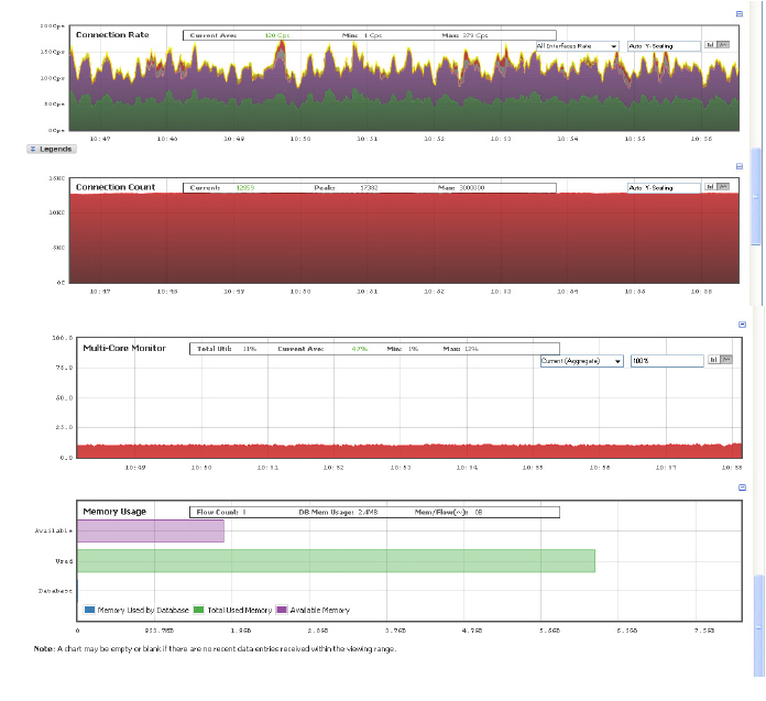
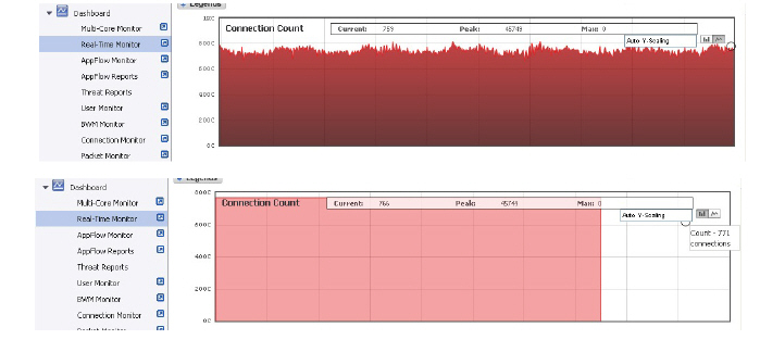
Connection Count Monitor
The Connection Count data flow provides the administrator a visual representation of “current” total number of connections, “peak” number of connections, and maximum. In this example, the y-axis displays the total number of connections from 0C (zero connections) to 1KC (one kilo connections).
.
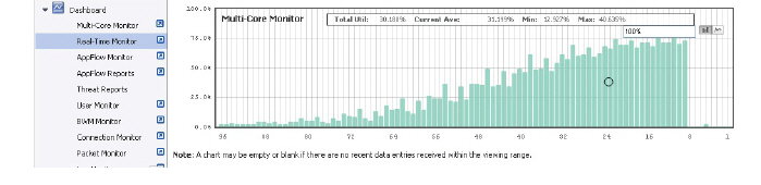
Multi-Core Monitor Flow
The Multi-Core Monitor displays dynamically updated statistics of the utilization of the individual cores of the SonicWALL SuperMassive.
On all SuperMassives, the first core of each blade handles control data, and memory is shared across all cores.
On the SuperMassive 10800, cores 1 through 8 handle the control plane, and the utilization of cores 1 through 8 is displayed in green on the Multi-Core Monitor. Each core can process a separate flow simultaneously, and up to 88 flows can be processed in parallel.
When browsing the Web Management interface and applying changes, high utilization of cores 1 through 8 is normal. All Web Management requests are processed by cores 1 through 8 and do not impact the other cores. Traffic handling and other critical, performance-oriented and system tasks are always prioritized by the scheduler, and will never be impacted by web management usage.
On the SuperMassive 10400, cores 1 through 4 handle the control plane, and the utilization of cores 1 through 4 is displayed in green on the Multi-Core Monitor.
Administrators are able to view the Multi-Core Monitor flow chart in a bar graph format or flow chart format. The bar graph format displays data pertaining to individual cores. In this graph the x-axis displays the cores where the y-axis displays the percentage of CPU used.
The flow chart format overlaps the Multi-Core Monitor data. The x-axis displays the current time and the y-axis displays the percentage of CPU used.
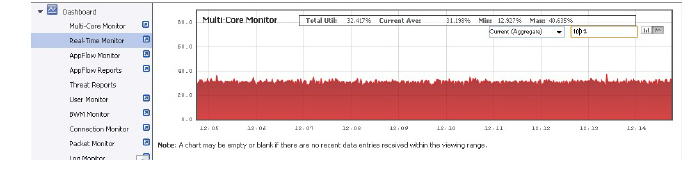
Scale, and View are options available to customize the Multi-Core Monitor interface.
|
Option
|
Widget
|
Description
|
|
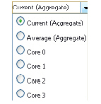
Aggregate Display
|
|
Specifies which Cores are displayed in the Multi-Core Monitor Flow Chart.
A drop menu allowing the administrator to specify Current (Aggregate), Average (Aggregate), and individual Cores.
The individual Cores vary depending on the number of Cores available. Multiple Cores can be selected if desired.
|
|
Scale
|
|
Allows for Auto Y-Scaling or customized scaling of the Multi-Core Monitor Flow Chart.
The values for customized scaling must be a numeric integer. Specifying a unit is optional. If a unit is desired, the four available options include:
• K for Kilo.
• M for Mega.
• G for Giga.
• % for percentage.
If a custom scale of 100 percent is desired, then “100%” should be entered. The numeric integer 100 is entered followed by the unit K.
|
|
Bar Graph Format
|

|
Displays the Multi-Core Monitor data in a bar graph format.
|
|
Flow Chart Format
|

|
Displays the Multi-Core Monitor data in a flow chart format.
|
|