|
•
|
|
•
|
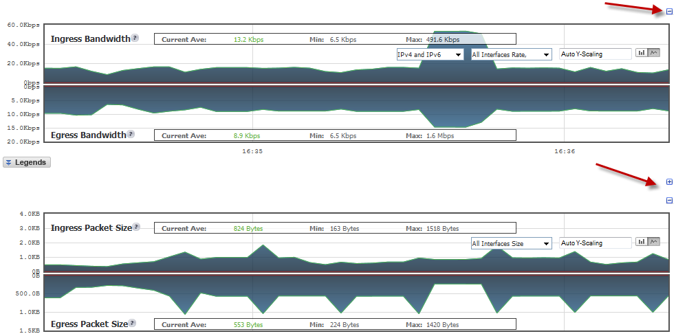
Directly above each chart, at the far right, is a Collapse icon that collapses the chart when it is clicked. When a chart is collapsed, an Expand icon is displayed, which expands the chart when it is clicked. Collapsing charts is useful when you want to compare other charts closer together.
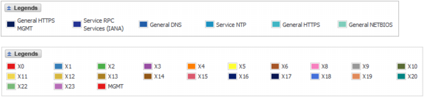
For most charts, you can display a legend that shows the name and color used for the applications or interfaces selected in the chart’s Display menu. To display or hide the legend, click on the Legends ![]() button below the chart.
button below the chart.
|
NOTE: If you selected to have the legends for the Applications and Bandwidth charts displayed within the charts, the Legends button has no effect on their display. For how to specify the location of legends, see Changing colors and legends position .
|
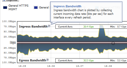
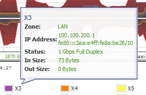
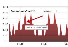
Various elements of the charts have associated tooltips:
|
•
|
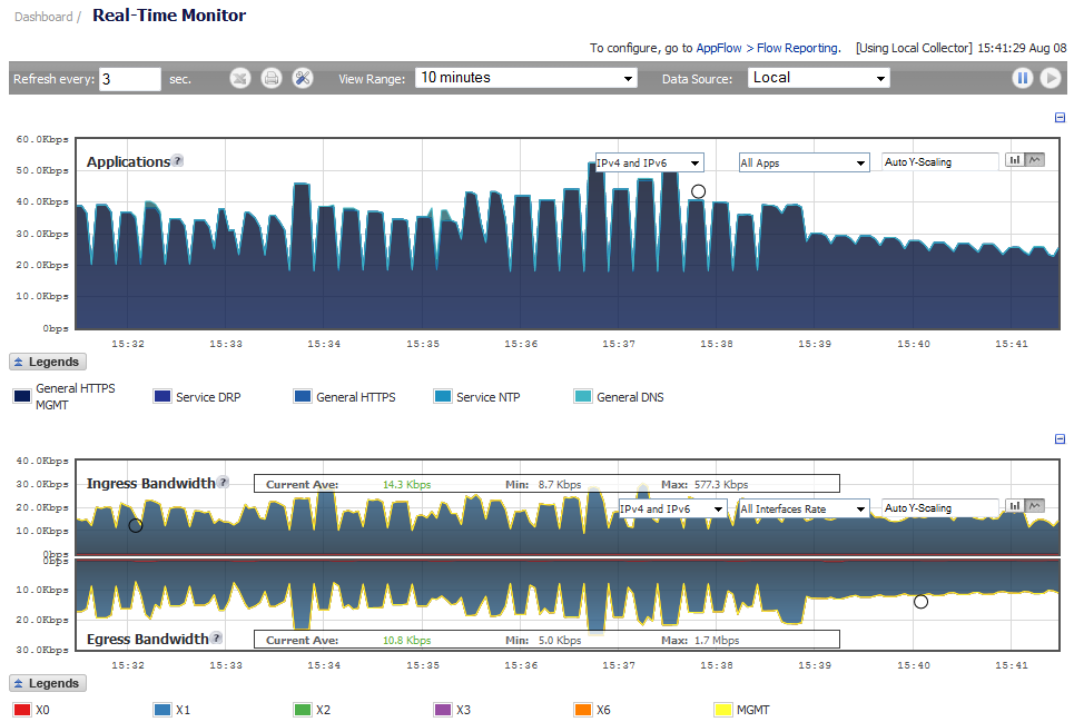
You can view individual charts in either bar chart format or flow (area) chart format. Each chart has Chart Format icons in the upper right corner of the chart. The default is flow chart format.
The bar chart format displays applications individually, thus allowing you to compare applications. In this chart, the applications, interfaces, or core monitors are arranged along the x-axis, for applications and interfaces according to the color code shown in the Legend. The y-axis displays information appropriate to the chart, such as the amount of traffic for each application or interface. To display the data in bar chart format, click on the Bar Chart icon. The following example is a Bar Chart view.
The following example is a Flow Chart view.
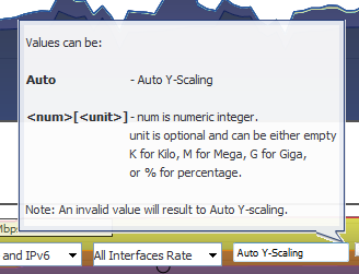
The Scale field, ![]() , in the upper right corner of a chart, allows for Auto Y-Scaling or custom scaling of a chart:
, in the upper right corner of a chart, allows for Auto Y-Scaling or custom scaling of a chart:
|
|
|
•
|
Auto (default) – Auto Y-Scaling
|
|
•
|
<num>[<unit>] – The values for customized scaling must be a numeric integer. Specifying a unit is optional. If a unit is desired, four options are available:
|
|
•
|
K for Kilo.
|
|
•
|
M for Mega.
|
|
•
|
G for Giga.
|
|
•
|
% for percentage.
|
For complete information on the SonicOS implementation of IPv6, see IPv6 .

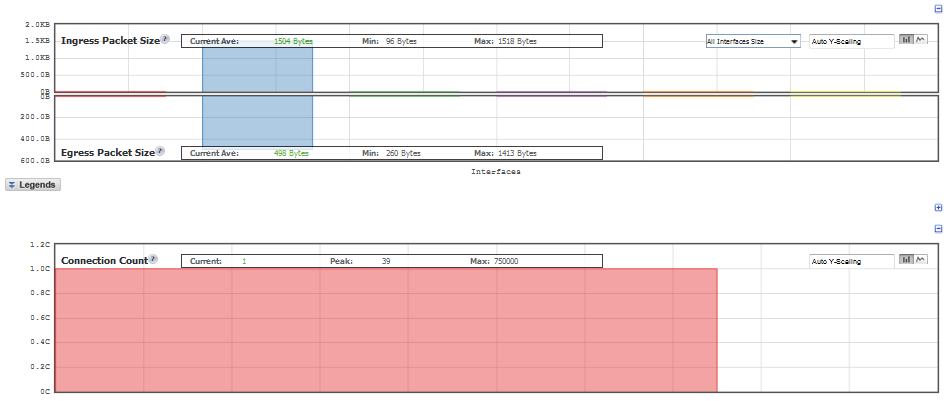
All charts, except Applications, display the current average, minimum, and maximum values for the chart. The values vary by chart and can be in Kbps, Pps (packets per second), Bytes, or Cps (connections per second).
![]()
For the Ingress/Egress charts, the information is displayed for both halves, the Ingress on the top and the Egress on the bottom. For the other charts, the information is displayed on the top.