Enabling the Real-Time Monitor and AppFlow Collection
The real-time application monitoring features rely on the flow collection mechanism in order to collect and display data. Before you can view the “applications” chart in the Real-Time Monitor, AppFlow Monitor, or AppFlow Reports, you must first enable and configure the flow collection feature.
To enable Real-Time Monitoring and Internal AppFlow collection:
Navigate to the Log > Flow Reporting page in the SonicOS management interface. For on-the-appliance flow collection, select the Report AppFlow To Internal Collector checkbox.
Select the Enable Real-Time Data Collection checkbox, and select from the Collect Real-Time Data For pull-down menu the reports you would like to see captured:
Top apps
Bits per second
Packets per second
Average packet size
Connections per second
Core utility
Memory utility
To enable these reports, click the Accept button to save your changes.
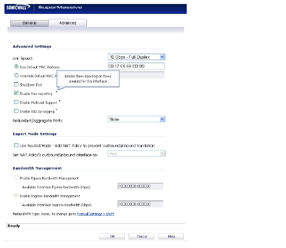
Navigate to the Network > Interfaces page.Click the Configure icon for the interface you wish to enable flow reporting on.
In the Advanced tab, ensure that the Enable flow reporting checkbox is selected.
Click the OK button to save your changes.
Repeat steps 6 through 7 for each interface you wish to monitor.
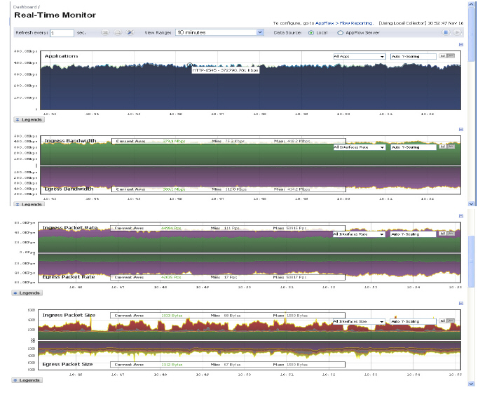
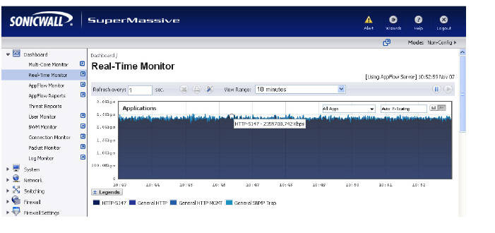
The Real-Time Monitor provides administrators an inclusive, multi-functional display with information about applications, bandwidth usage, packet rate, packet size, connection rate, connection count, multi-core monitoring, and memory usage.
The Real-Time Monitor Toolbar contains features to specify the refresh rate, export details, configure color palettes, change the amount of data displayed, and pause or play the data flow. Changes made to the toolbar apply across all the data flows.
Option
Widget
Description
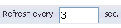
Refresh rate
Determines the frequency at which data is refreshed. A numerical integer between 1 to 10 seconds is required. One second is the default.
Export
Exports the data flow into a comma separated variable (.csv) file. The default file name is sonicflow.csv.
Configure
Allows for customization of the color palette for the Application Chart and Bandwidth Chart.
To customize the Color Palette:
Enter the desired hexadecimal color codes in the provided text fields.
Select Default for a default range of colors.
Select Generate to generate a random range of colors.
If a gradient is desired, select the Use Gradient box located below the text fields.
View Range
Displays data pertaining to a specific span of time. Two minutes is the default setting for the view range.
Time & Date
Displays the current time in 24-hour format (hh:mm:ss), and the current date in Month/Day format.
Pause
Freezes the data flow. The time and date will also freeze.
The Pause button will appear gray if the data flow has been frozen.
Play
Unfreezes the data flow. The time and date will refresh as soon as the data flow is updated.
The Play button will appear gray if the data flow is live.
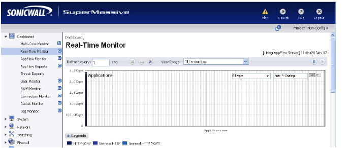
Applications Monitor
The Applications data flow provides a visual representation of the current applications accessing the network.
Options are available to Display, Scale, and View the Application interface.
Option
Widget
Description
Lock
Locks the Display options for the Application interface. The lock and unlock option is available when you select “Most Frequent Apps.” Most Frequent Apps displays the top-25 apps, you can use the lock or unlock option to keep the report from altering the top-25 apps.
Unlock
Unlock the Display options for the Application interface.
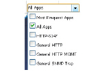
Application Display
Specifies the applications displayed in the Application Flow Chart.
A drop menu allows the administrator to specify Most Frequent Apps, All Apps, or individual applications. If desired, multiple applications can be selected by clicking more than one check box.
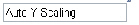
Scale
Allows for Auto Y-Scaling or customized scaling of the Application Flow Chart.
The values for customized scaling must be a numeric integer. Specifying a unit is optional. If a unit is desired, these are the available options:
K for Kilo.
M for Mega.
G for Giga.
% for percentage.
If a custom scale of 100Kbps is desired, then “100K” should be entered. The numeric integer 100 is entered followed by the unit K.
Bar Graph
Displays the Applications data in a bar graph format.
Flow Chart
Displays the Applications data in a flow chart format.
Available Formats
Administrators are able to view the Application flow charts in a bar graph format or flow chart format. The bar graph format displays applications individually, allowing administrators to compare applications. In this graph, the x-axis displays the name of the applications. The y-axis displays the amount of traffic for each application. The following example is a “Flow Chart” view.
The flow chart format displays over lapping application data. In this graph, the x-axis displays the current time and the y-axis displays the traffic for each application. The following example is a “Bar Chart” view.
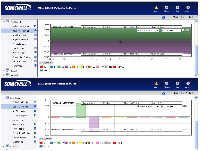
Ingress and Egress Bandwidth Flow
The Ingress and Egress Bandwidth data flow provides a visual representation of incoming and outgoing bandwidth traffic. The current percentage of total bandwidth used, average flow of bandwidth traffic, and the minimum and maximum amount of traffic that has gone through each interface is available in the display. Administrators are able to view the Ingress and Egress Bandwidth flow chart in a bar graph format or flow chart format.
The bar graph format displays data pertaining to individual interfaces in a bar graph; allowing administrators to compare individual Bandwidth Interfaces. In this graph, the x-axis denotes the Interfaces whereas the y-axis denotes the Ingress and Egress Bandwidth traffic.
The flow chart format overlaps the Bandwidth Interfaces; allowing administrators to view all of the Ingress and Egress Bandwidth traffic as it occurs. The x-axis displays the current time and the y-axis displays the Ingress and Egress Bandwidth traffic.
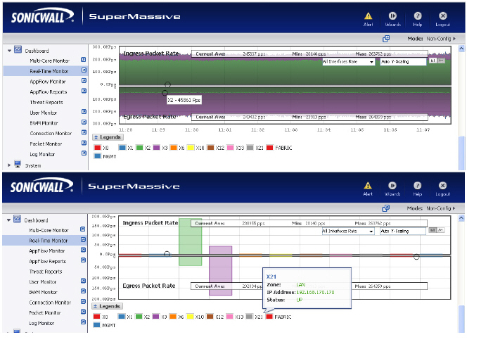
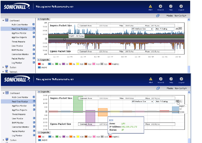
Options are available to customize the Display, Scale, and View of the Ingress and Egress Bandwidth interface.
Option
Widget
Description
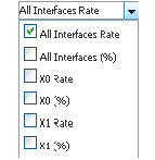
Interface Rate Display
Specifies which Interfaces are displayed in the Bandwidth Flow Chart.
A drop menu provides the administrator with options to specify All Interfaces Rate, All Interfaces, and individual interfaces.
The individual interfaces vary depending on the number of interfaces on the administrator’s network. Multiple interfaces can be selected if desired.
Scale
Allows for Auto Y-Scaling or custom scaling of the Bandwidth Flow Chart.
The values for customized scaling must be a numeric integer. Specifying a unit is optional. If a unit is desired, four options are available:
K for Kilo.
M for Mega.
G for Giga.
% for percentage.
If a custom scale of 100Kbps is desired, then “100K” should be entered. The numeric integer 100 is entered followed by the unit K.
Bar Graph Format
Displays the real-time Bandwidth data in a bar graph format.
Flow Chart Format
Displays the real-time Bandwidth data in a flow chart format.
Tooltips
Rolling over the interfaces provides tooltips with information about the interface assigned zone, IP address, and current port status.
NoteThe Bandwidth flow charts have no direct correlation to the Application flow charts.
Packet Rate Monitor
The Packet Rate Monitor provides the administrator with information on the ingress and egress packet rate in packet per second (pps). This can be configured to show packet rate by network interface. The graph shows the packet rate current average, minimum packet rate, and maximum packet rate for both ingress and egress network traffic.
Packet Size Monitor
The Packet Size Monitor provides the administrator with information on the ingress and egress packet rate in kilobytes per second (Kps). This can be configured to show packet size by network interface. The graph shows the packet size current average, minimum packet size, and maximum packet size for both ingress and egress network traffic.
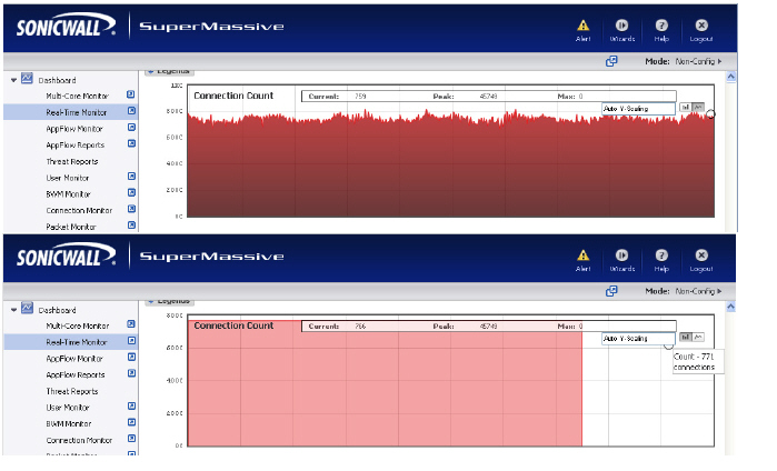
Connection Count Monitor
The Connection Count data flow provides the administrator a visual representation of “current” total number of connections, “peak” number of connections, and maximum. In this example, the y-axis displays the total number of connections from 0C (zero connections) to 1KC (one kilo connections).
.
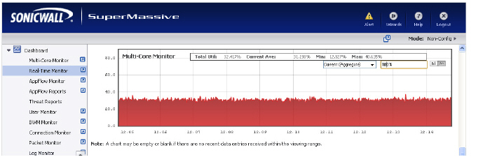
Multi-Core Monitor Flow
The Multi-Core Monitor displays dynamically updated statistics on utilization of the individual cores of the SonicWALL SuperMassive. Core 1 through core 8 handles the control plane. Core 1 through core 8 usage is displayed in green on the Multi-Core Monitor. The remaining cores handle the data plane. To maximize processor flexibility, functions are not dedicated to specific cores; instead all cores can process all data plane tasks. Memory is shared across all cores. Each core can process a separate flow simultaneously, allowing for up to 88 flows to be processed in parallel.
Administrators are able to view the Multi-Core Monitor flow chart in a bar graph format or flow chart format. The bar graph format displays data pertaining to individual cores. In this graph the x-axis displays the cores where the y-axis displays the percentage of CPU used.
The flow chart format overlaps the Multi-Core Monitor data. The x-axis displays the current time and the y-axis displays the percentage of CPU used.
Scale, and View are options available to customize the Multi-Core Monitor interface.
Option
Widget
Description
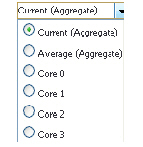
Aggregate Display
Specifies which Cores are displayed in the Multi-Core Monitor Flow Chart.
A drop menu allowing the administrator to specify Current (Aggregate), Average (Aggregate), and individual Cores.
The individual Cores vary depending on the number of Cores available. Multiple Cores can be selected if desired.
Scale
Allows for Auto Y-Scaling or customized scaling of the Multi-Core Monitor Flow Chart.
The values for customized scaling must be a numeric integer. Specifying a unit is optional. If a unit is desired, the four available options include:
K for Kilo.
M for Mega.
G for Giga.
% for percentage.
If a custom scale of 100 percent is desired, then “100%” should be entered. The numeric integer 100 is entered followed by the unit K.
Bar Graph Format
Displays the Multi-Core Monitor data in a bar graph format.
Flow Chart Format
Displays the Multi-Core Monitor data in a flow chart format.
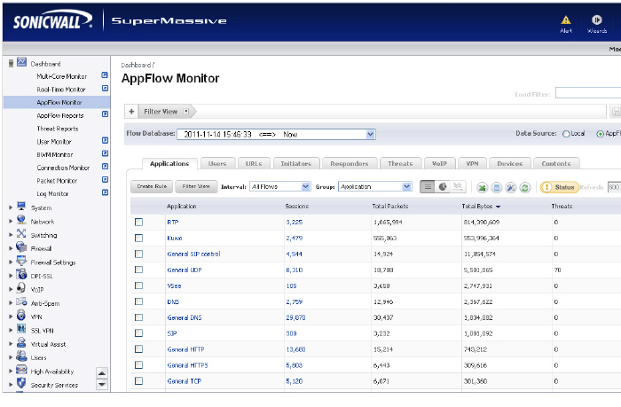
Dashboard > AppFlow Monitor
The AppFlow Monitor provides administrators with real-time, incoming and outgoing network data. Various views and customizable options in the AppFlow Monitor Interface assist in visualizing the traffic data by applications, users, URLs, initiators, responders, threats, VoIP, VPN, devices, or by contents.
The AppFlow Monitor Filter Options allows the administrator to filter out incoming, real-time data. Administrators can apply, create, and delete custom filters to customize the information they wish to view. The Filter Options apply across all the Application Flow tabs. Please refer to the “Using Filtering Options” section on page 60.
Option
Widget
Description
Add to Filter
Adds current selection to filter.
At least 1 item must be selected in order to use the Filter Options. After doing so, all other tabs will update with information pertaining to the items in the filter.
Remove from Filter
Removes the current selection from the filter view by clicking on the X.
Load Filter
Loads existing filter settings.
Save
Saves the current filter settings.
Delete
Deletes the current filter settings.
AppFlow Monitor Tabs
The AppFlow Monitor Tabs contains details about incoming and outgoing network traffic. Each tab provides a faceted view of the network flow. The data is organized by Applications, Users, URLs, Initiators, Responders, Threats, VoIP, VPN, Devices, and Content.
The Applications tab displays a list of Applications currently accessing the network.
The Users tab displays a list of Users currently connected to the network.
The URLs tab displays a list of URLs currently accessed by Users.
The Initiators tab displays details about current connection initiators.
The Responders tab displays details about current connection responders.
The Threats tab displays a list of threats encountered by the network.
The VoIP tab displays current VoIP and media traffic.
The VPN tab displays a list of VPN sessions connected to the network.
The Devices tab displays a list of devices currently connected to the network.
The Contents tab displays information about the type of traffic flowing through the network.
AppFlow Monitor Toolbar
The AppFlow Toolbar allows for customization of the AppFlow Monitor interface. The ability to create rules and add items to filters allows for more application and user control. Different views, pause and play abilities, customizable data intervals and refresh rates are also available to aid in visualizing incoming, real-time data.
Allows for customization of the display by enabling or disabling columns for Applications, Sessions, Packets, Bytes, Rate, and Threats. Also allows the administrator to enable or disable commas in numeric fields.
Refresh Button
Refreshes the real-time data.
Status Update
Provides status updates about App signatures, GAV Database, Spyware Database, IPS Database, Country Database, Max Flows in Database, and CFS Status. Please refer to the “AppFlow Monitor Status” section on page 57 for more information.
A green status icon signifies that all appropriate signatures and databases are active.
A yellow status icon signifies that some or all signature databases are still being downloaded or could not be activated.
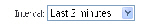
Refresh Rate
Rate at which data is refreshed.
A numeric integer between 10 and 999 must be specified.
If 300 is entered in the numeric field, that means the data flow will refresh every 300 seconds.
Pause/Play
Freezes and unfreezes the data flow. Doing so gives the administrator flexibility when analyzing real-time data.
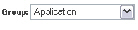
Group Options
The Group option sorts data based on the specified group. Each tab contains different grouping options.
The Applications tab can be grouped by:
Application: Displays all traffic generated by individual applications.
Category: Groups all traffic generated by an application category.
The Users tab can be grouped by:
User Name: Groups all traffic generated by a specific user.
IP Address: Groups all traffic generated by a specific IP address.
Domain Name: Groups all traffic generated by a specific domain name.
Auth Type: Groups all traffic generated by a specific authorizing method.
The URL tab can be grouped according to:
URL: Displays all traffic generated by each URL.
Domain Name: Groups all traffic generated by a domain name.
Rating: Groups all traffic generated based on CFS rating.
The Initiators tab can be grouped according to:
IP Address: Groups all traffic generated by a specific IP address.
Interface: Groups all traffic according to the firewall interface.
Country: Groups all traffic generated by each country, based on country IP database.
Domain Name: Groups all traffic generated by a domain name.
The Responders tab can be grouped according to:
IP Address: Groups all traffic by IP address.
Interface: Groups responders by interface.
Country: Groups responders by each country, based on country IP database.
Domain Name: Groups responders by domain name.
The Threats tab can be grouped according to:
Intrusions: Displays flows in which intrusions have been identified.
Viruses: Displays flows in which viruses have been identified.
Spyware: Displays flows in which spyware has been identified.
Spam: Shows all flows that fall under the category of spam.
The VoIP tab can be grouped according to:
Media Type: Groups VoIP flows according to media type.
Caller ID: Groups VoIP flows according to caller ID.
The VPN tab can be grouped according to:
Remote IP Address: Groups VPN flows access according to the remote IP address.
Local IP Address: Groups VPN flows access according to the local IP address.
Name: Groups VPN flows access according to the tunnel name.
The Devices tab can be grouped according to:
IP Address: Groups flows by IP addresses inside the network.
Interface: Groups flows by interfaces on the firewall.
Name: Groups flows by device name, or MAC address.
The Contents tab can be grouped according to:
Email Address: Groups contents by email address.
File Name: Groups flows by file type detected.
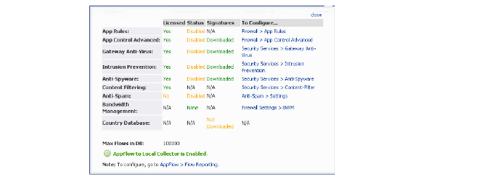
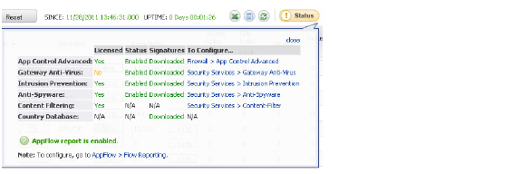
AppFlow Monitor Status
The AppFlow Monitor Status dialog appears when the cursor rolls over the Status button in the toolbar. The AppFlow Monitor Status provides signature updates about App Rules, App Control Advanced, GAV, IPS, Anti-Spyware, CFS, Anti-Spam, BWM, and country databases.
The option to enable or disable the flow collection is available in the Status dialog. If the Status dialog is no longer wanted, click close in the upper-right corner.
AppFlow Monitor Views
Three views are available for the AppFlow Monitor: Detailed List View, Pie Chart and Flow Chart Graph View. Each view provides the administrator a unique display of incoming, real-time data.
In the List View, each AppFlow tab is comprised of columns displaying real-time data. These columns are organized into sortable categories.
Check Box: Allows the administrator to select the line item for creation of filters.
Main Column: The title of the Main Column is dependent on the selected tab. For example, if the Users Tab is the selected, then the Main Column header will read “Users”. In that column, the name of the Users connected to the network are shown. Clicking on the items in this column will bring up a popup with relevant information on the item displayed.
Sessions: Clicking on this number will bring up a table of all active sessions.
Packets: Displays the number of data packets transferred.
Bytes: Displays the number of bytes transferred.
Rate (KBps): Displays the rate at which data is transferred.
Threats: Displays the number of threats encountered by the network.
Total: Displays the total Sessions, Packets, and Bytes sent during the duration of the current interval.
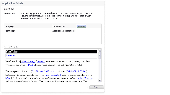
Application Details
Each item listed in the Main Column provides a link to an Application Detail dialog. A display appears when the item links are clicked. The dialog provides:
Description of the item
Information pertaining to the category, threat level, type of technology the item falls under, and other additional information
Application details are particularly useful when an Administrator does not recognize the name of an Application.
Graph View
The Graph View displays the top applications and the percentage of bandwidth used. The percentage of bandwidth used is determined by taking the total amount of bandwidth used by the top applications, and dividing that total by the amount of top applications.
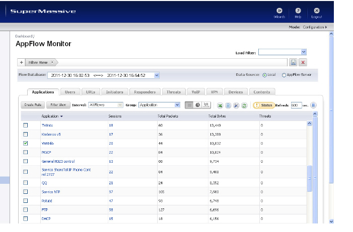
Using Filtering Options
Using filtering options allow administrators to reduce the amount of data seen in the AppFlow Monitor. By doing so, administrators can focus on points of interest without distraction from other applications. To use the Filtering Options, perform the following steps:
Navigate to Dashboard > AppFlow Monitor>Applications. Select the check boxes of the applications you wish to add to the filter. In this case, Ventrilo is selected.
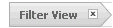
Click Filter View to add Ventrilo to the filter.
Once the application is added to the filter, only Ventrilo is visible in the Applications tab.
More information about Users, peer connectivity, and packets sent are visible in the AppFlow Monitor tabs. The Users using Ventrilo are visible in the Users tab. The IP Addresses of these users are visible in the Initiators tab. The IP Addresses of the connected peers who are sharing packets are visible in the Responders Tab.
Generating Application Visualization Report
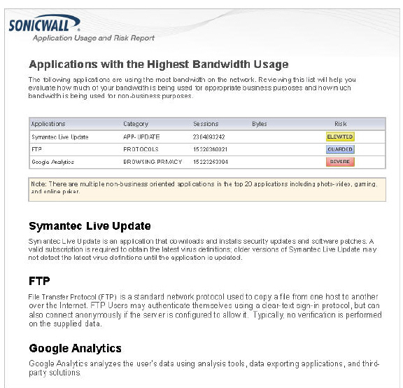
The SonicWALL Application Intelligence and Control feature allows administrators to maintain granular control of applications and users by creating bandwidth management policies based on local pre-defined categories, individual applications, or even users and groups. With the Application Visualization feature, administrators are able to view real-time graphs of applications, ingress and egress bandwidth, Websites visited, and all user activity. Administrators are able to adjust network policies based on these critical observations. The SonicWALL Application Usage and Risk Report combines the results of these two features in a downloadable report listing the following categories:
High Risk Applications in Use
Top URL Categories in Use
Applications with the Highest Bandwidth Usage
Application Usage by Category and Technology
Top Findings of Network Characteristics
Recommendations based on the Top Findings
Navigate to the Dashboard > App Flow Monitor page and click the download PDF report button from the AppFlow toolbar. Next, click the Generate Report button to get a dynamically generated report specific to your SonicWALL SuperMassive appliance. Note the report may take a few minutes to generate and download.
Once the report is generated, an executive summary is provided at the top of the report for a holistic overview of your network. The report contains a real-time snapshot of network traffic to guide you in implementing new bandwidth management policies. An example SonicWALL Application Usage and Risk Analysis report is provided below listing applications with the highest bandwidth usage, their application category, number of sessions, application risk level, and a detailed description of the application.
Dashboard > AppFlow Reports
The AppFlow Reports page provides administrators with configurable scheduled reports by applications, viruses, intrusions, spyware, and URL rating. AppFlow Reports statistics enable network administrators to view a top-level aggregate report of what is going on in your network. This enable network administrators to answer the following questions with a quick glance:
What are the top most used applications running in my network?
Which applications in terms of total number of sessions and bytes consume my network bandwidth?
Which applications have viruses, intrusions, and spyware?
What website categories are my users visiting?
The report data can be viewed from the point of the last system restart, since the system reset, or by defining a schedule range. The page also provides the ability to schedule a report sent by FTP or by email.
The AppFlow Reports feature requires that you have the latest SonicWALL Security Services signature downloads enabled for the latest dynamic protection updates. Click on the Status button to view the list of enabled SonicWALL Security Services as illustrated below.
Viewing AppFlow Reports Since Up Time Restart
To view an AppFlow report since the last reboot or restart of the SuperMassive, select Since Restart from the View pull-down menu. This report shows the aggregate statistics since the last reboot of the device indicated in green. For example, indicated by date and time: SINCE: 11/22/2011 15:40:06.000.
Viewing AppFlow Reports Since Up Time Last Reset
To view an AppFlow report since the last reset of the SuperMassive, select Since Last Reset from the View pull-down menu. This report shows the aggregate statistics since the last time the administrator cleared the statistics by pressing the reset button indicated in green. For example, indicated by date and time: SINCE: 11/23/2011 18:33:02.000. The reset option allows network administrators to quickly view AppFlow Report statistics from a fresh reset of network flows. The reset clears the counters seen at the bottom of the page, which displays counter totals for number of sessions, initiator and responder bytes, to the number of intrusions and threats.
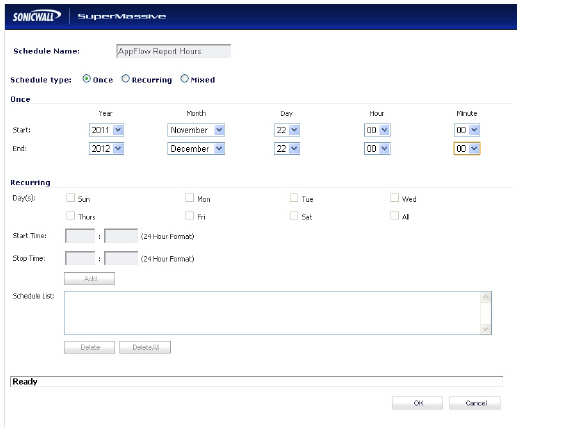
Viewing AppFlow Reports on Schedule
To view an AppFlow report by a defined schedule start and end time, select On Schedule from the View pull-down menu and click the Configure button. This report shows AppFlow statistics collected during the time range specified in the configure settings options. Once the end time of the schedule is reached, scheduled AppFlow statistics are exported automatically to an FTP server or an email server. AppFlow statistical data is exported in CSV file format. Once the AppFlow statistics are exported, the data is refreshed and cleared.
To configure an On Schedule AppFlow report, perform the following configuration of selecting either an FTP server or email server for CSV file export:
Navigate to the AppFlow > AppFlow Reports page. Select On Schedule from the View pull-down menu, and click the Configure button. The Schedule Report options page displays.
Select to have your AppFlow Reports data automatically sent to an FTP server or an email server. If your email server requires SMTP authentication, enter the SMTP server login and password.
Click the Set Schedule button to define a start and end schedule. The AppFlow Reports schedule option page displays.
In Schedule type, select Once to create a one-time schedule, select Recurring to create an ongoing scheduled, or select Mixed to create both a one-time schedule and an ongoing schedule. The Once schedule options allow you to set reporting schedules based on a calendar start and end date with time in hours and minutes. The Recurring schedule options allow to select ongoing schedules based on days of the week and start and end hour and minute time targets. The Recurring schedule displays your selections in the Schedule List.
Click OK to save your AppFlow Reports schedule.
On the Schedule Reports options page, click the Apply button to start using your AppFlow Reports schedule object settings.
Dashboard > Threat Reports
This section describes how to use the SonicWALL Threat Reportsfeature on a SonicWALL SuperMassive. This chapter contains the following sections:
The SonicWALL Threat Reports provides reports of the latest threat protection data from a single SonicWALL appliance and aggregated threat protection data from SonicWALL SuperMassives deployed globally. The SonicWALL Threat Reports displays automatically upon successful authentication to a SonicWALL SuperMassive, and can be viewed at any time by navigating to the Dashboard > Threat Reports menu in the left-hand menu.
Reports in the Threat Reports include:
Viruses Blocked
Intrusions Prevented
Spyware Blocked
Multimedia (IM/P2P) Detected/Blocked
Each report includes a graph of threats blocked over time and a table of the top blocked threats. Reports, which are updated hourly, can be customized to display data for the last 12 hours, 14 days, 21 days, or 6 months. For easier viewing, SonicWALL Threat Reports reports can be transformed into a PDF file format with the click of a button.
Benefits
The Threat Reports provides the latest threat protection information to keep you informed about potential threats being blocked by SonicWALL SuperMassives. If you subscribe to SonicWALL’s security services, including Gateway Anti-Virus, Gateway Anti-Spyware, Intrusion Prevention Service (IPS), and Content Filtering Service, you are automatically protected from the threats reported by the SonicWALL Threat Reports. SonicWALL’s security services include ongoing new signature updates to protect against the latest virus and spyware attacks.
How Does the Threat Reports Work?
The SonicWALL Threat Reports provides global and appliance-level threat protection statistics. At the appliance level, threat protection data from your SonicWALL SuperMassive is displayed. At the global level, the SonicWALL Threat Reports is updated hourly from the SonicWALL backend server with aggregated threat protection data from globally-deployed SonicWALL SuperMassives. Data provided by the SonicWALL backend server is cached locally for reliable delivery.
To be protected from the threats reported in the SonicWALL Threat Reports, it is recommended that you purchase SonicWALL security services. For more information about SonicWALL security services, see “Security Services” on page 787.
NoteThe SonicWALL SuperMassive must have Internet connectivity (including connection to a DNS server) to receive the latest threat protection statistics from the SonicWALL backend server, which reports aggregated data from globally deployed SonicWALL SuperMassives. If you lose connectivity, cached data from the last update will display, and the latest data will not be available until connectivity is restored.
SonicWALL Threat Reports Configuration Tasks
The SonicWALL Threat Reports can be configured to display global or appliance-level statistics, to display statistics for different time periods, and to generate a custom PDF file.
The SonicWALL Threat Reports displays automatically upon successful login to a SonicWALL SuperMassive. You can access the SonicWALL Threat Reports at any time by navigating to Dashboard > Threat Reports in the left-hand menu. You may see the introductory screen shown below before the dashboard displays.
To view SonicWALL Threat Reports global reports, select the radio button next to Global in the top of the Dashboard > Threat Reports screen. To view appliance-level reports, select the radio button next to the appliance serial number.
Selecting Custom Time Interval
The SonicWALL Threat Reports reports default to a view of reports from the “Last 14 Days,” providing an aggregate view of threats blocked during that time period. You can configure each report to one of four optional time periods. Each report can be configured to reflect a different time period. To change a report to reflect a different time period, perform the following steps:
Select the report you want to change:
Viruses Blocked
Intrusions Prevented
Spyware Blocked
Multimedia (IM/P2P) Detected/Blocked
Next to the title of the selected report, click the pull-down menu and select one of the following options:
Last 12 Hours - Displays threat information from the last 12 hours
Last 14 Days - Displays threat information from the last 14 days
Last 21 Days - Displays threat information from the last 21 days
Last 6 Months - Displays threat information from the last 6 months
Generating a Threat Reports PDF
To create a PDF version of the SonicWALL Threat Reports, first select the desired view (global or appliance-level) and the desired time period for each report (the last 12 hours, 14 days, 21 days, or 6 months). Click the button at the top of the page.
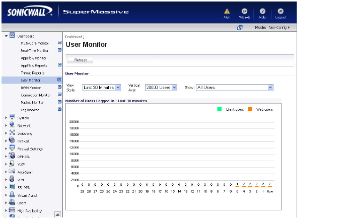
Dashboard > User Monitor
The Dashboard > User Monitor page displays details on all user connections to the SonicWALL SuperMassive.
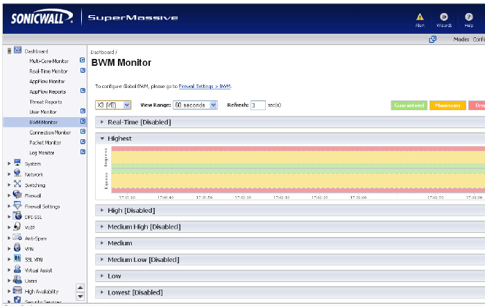
Dashboard > BWM Monitor
The Dashboard > BWM Monitor page displays per-interface bandwidth management for ingress and egress network traffic. The BWM monitor graphs are available for real-time, highest, high, medium high, medium, medium low, low and lowest policy settings. The view range is configurable in 60 seconds, 2 minutes, 5 minutes, and 10 minutes (default). The refresh interval rate is configurable from 3 to 30 seconds. The bandwidth management priority is depicted by guaranteed, maximum, and dropped.
Dashboard > Connections Monitor
The Dashboard > Connections Monitor page displays details on all active connections to the SonicWALL SuperMassive.
Viewing Connections
The connections are listed in the Connections Monitor table.
Filtering Connections Viewed
You can filter the results to display only connections matching certain criteria. You can filter by Source IP, Destination IP, Destination Port, Src Interface, Dst Interface, and Protocol. Enter your filter criteria in the Connections Monitor Settings table.
The fields you enter values into are combined into a search string with a logical AND. For example, if you enter values for Source IP and Destination IP, the search string will look for connections matching:
Source IP AND Destination IP
Check the Group box next to any two or more criteria to combine them with a logical OR. For example, if you enter values for Source IP, Destination IP, and Protocol, and check Group next to Source IP and Destination IP, the search string will look for connections matching:
(Source IP OR Destination IP) AND Protocol
Click Apply Filter to apply the filter immediately to the Active Connections table. Click Reset to clear the filter and display the unfiltered results again.
You can export the list of active connections to a file. Click Export Results, and select if you want the results exported to a plain text file, or a Comma Separated Value (CSV) file for importing to a spreadsheet, reporting tool, or database. If you are prompted to Open or Save the file, select Save. Then enter a filename and path and click OK.