AppFlowMonitor
Dashboard > AppFlow Monitor
The AppFlow Monitor provides real-time, incoming and outgoing network data. Various views and customizable options in the AppFlow Monitor Interface assist in visualizing the traffic data by applications, users, URLs, initiators, responders, threats, VoIP, VPN, devices, or contents.
Topics:
• AppFlow Monitor Tabs
• AppFlow Monitor Toolbar
• Group Options
• AppFlow Monitor Status
• AppFlow Monitor Views
• Filter Options
• Generating Application Visualization Report
AppFlow Monitor Tabs
The AppFlow Monitor Tabs contain details about incoming and outgoing network traffic. Each tab provides a faceted view of the network flow. The data is organized by Applications, Users, URLs, Initiators, Responders, Threats, VoIP, VPN, Devices, and Content.
• The Applications tab displays a list of Applications currently accessing the network.
• The Users tab displays a list of Users currently connected to the network.
• The URLs tab displays a list of URLs currently accessed by Users.
• The Initiators tab displays details about current connection initiators.
• The Responders tab displays details about current connection responders.
• The Threats tab displays a list of threats encountered by the network.
• The VoIP tab displays current VoIP and media traffic.
• The VPN tab displays a list of VPN sessions connected to the network.
• The Devices tab displays a list of devices currently connected to the network.
• The Contents tab displays information about the type of traffic flowing through the network.
AppFlow Monitor Toolbar
The AppFlow Toolbar allows for customization of the AppFlow Monitor interface. The ability to create rules and add items to filters allows for more application and user control. Different views, pause and play abilities, customizable data intervals and refresh rates are also available to aid in visualizing incoming, real-time data. Selecting data by group and configuring the columns displayed on a tab enable refining of the display.
|
Option
|
Widget
|
Description
|
|
Create Rule
|

|
Starts the App Control Wizard. For more information on using this wizard, refer to Application Control.
Note: General- and service-type applications cannot be included in a rule.
|
|
Filter View
|

|
Correlates data among the tabs. For more information about creating a filter, see Filter Options.
|
|
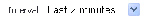
Interval
|
|
Specifies the span of time in which data is collected.
|
|
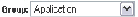
Group
|
|
Categorizes selections according to the available grouping options, which vary depending on the tab that is selected. See Group Options.
|
|
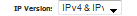
IP Version
|
|
Allows selection of internet protocol: IPv4, IPv6, or both (IPv4 & IPv6).
|
|
List View
|

|
Provides a detailed list view of the data flow. See List View.
|
|
Pie Chart View
|

|
Provides a pie chart view of the data flow. See Pie Chart View.
|
|
Flow Chart View
|

|
Provides a flow chart view of the data flow. See Flow Chart View.
|
|
Export
|

|
Exports the data flow in comma separated variable (.csv) format.
|
|
Print PDF Report
|

|
Generates an Application Visualization Report. For more information, refer to Generating Application Visualization Report.
|
|
Configuration
|

|
Customizes the display by enabling or disabling columns for # (number), Tab subject (such as Applications or VPN), Sessions, Packets, Bytes, Rate, and Threats. Also enables or disables commas in numeric fields.
|
|
Refresh Button
|

|
Refreshes the real-time data display.
|
|
Status Update
|


|
Provides status updates about App signatures, GAV Database, Spyware Database, IPS Database, Country Database, Max Flows in Database, CFS Status, and more. For more information, see AppFlow Monitor Status.
• A green status icon signifies that all appropriate signatures and databases are active.
• A yellow status icon signifies that some or all signature databases are still being downloaded or could not be activated.
• A red status icon signifies that the database is not downloaded or active.
|
|
Group Options
The Group option sorts data based on the specified group. Each tab contains different grouping options.
|
This Tab
|
Can be Grouped by
|
Which
|
|
Applications
|
Application (default)
|
Displays all traffic generated by individual applications.
|
|
Category
|
Groups all traffic generated by an application category.
|
|
Signatures
|
Groups all traffic generated by an application signature
|
|
Users
|
User Name (default)
|
Groups all traffic generated by a specific user.
|
|
IP Address
|
Groups all traffic generated by a specific IP address.
|
|
Domain Name
|
Groups all traffic generated by a specific domain name.
|
|
Auth Type
|
Groups all traffic generated by a specific authorizing method.
|
|
URLs
|
URL (default)
|
Displays all traffic generated by each URL.
|
|
Domain Name
|
Groups all traffic generated by a domain name.
|
|
Rating
|
Groups all traffic generated based on CFS rating.
|
|
Initiators
|
IP Address (default)
|
Groups all traffic generated by a specific IP address.
|
|
Interface
|
Groups all traffic according to the firewall interface.
|
|
Country
|
Groups all traffic generated by each country, based on country IP database.
|
|
Responders
|
IP Address (default)
|
Groups all traffic by IP address.
|
|
Interface
|
Groups responders by interface.
|
|
Country
|
Groups responders by each country, based on country IP database.
|
|
Threats
|
Intrusions
|
Displays flows in which intrusions have been identified.
|
|
Viruses
|
Displays flows in which viruses have been identified.
|
|
Spyware
|
Displays flows in which spyware has been identified.
|
|
Spam
|
Shows all flows that fall under the category of spam.
|
|
All (default)
|
Displays all flows in which a threat has been identified or that fall under the category of spam.
|
|
VoIP
|
Media Type (default)
|
Groups VoIP flows according to media type.
|
|
Caller ID
|
Groups VoIP flows according to caller ID.
|
|
VPN
|
Remote IP Address (default)
|
Groups VPN flows access according to the remote IP address.
|
|
Local IP Address
|
Groups VPN flows access according to the local IP address.
|
|
Name
|
Groups VPN flows access according to the tunnel name.
|
|
Devices
|
IP Address (default)
|
Groups flows by IP addresses inside the network.
|
|
Interface
|
Groups flows by interfaces on the firewall.
|
|
Name
|
Groups flows by device name or MAC address.
|
|
Contents
|
Email Address (default)
|
Groups contents by email address.
|
|
File Type
|
Groups flows by file type detected.
|
|
AppFlow Monitor Status
The AppFlow Monitor Status tooltip appears when the cursor rolls over the Status button in the toolbar. The AppFlow Monitor Status provides signature updates about App Rules, App Control Advanced, GAV, IPS, Anti-Spyware, CFS, Anti-Spam, BWM, country databases, Geo-IP blocking, and Botnet blocking. The tooltip also displays the maximum flows in the database and how AppFlow is enabled. For easy configuration of the AppFlow Monitor display, the tooltip provides links to the appropriate UI page for each item as well as a link to AppFlow > Flow Reporting for configuring AppFlow.
If the Status tooltip is no longer wanted, click close in the upper-right corner.
AppFlow Monitor Views
Three views are available for the AppFlow Monitor: List View, Pie Chart View, and Flow Chart View. Each view provides a unique display of incoming, real-time data.
Topics:
• List View
• Pie Chart View
• Flow Chart View
List View
In the List View, each AppFlow tab comprises columns displaying real-time data. These columns are organized into sortable categories. Some columns are common to all tabs.The VoIP tab, however, also has columns specific to it. There are tooltips and flow tables associated with some column items.
Topics:
• Common Columns
• VoIP Columns
• Detail Tooltips
• Flow Tables
Common Columns
These columns are common to all tabs.
• Check Box: Allows the selection of the line item for creation of filters and rules.
Note General-type applications and unknown users cannot be included in a rule.
• Main Column: The title of the Main Column depends on the selected tab. For example, if the Users Tab is the selected, then the Main Column header will read “Users”. In that column, the name of the Users connected to the network are shown. Clicking on an item in this column will bring up a tooltip with relevant information on the item; see Detail Tooltips.
• Sessions: Displays the number of sessions associated with the item in the Main Column. Clicking on this number will display a Flow Table of all the sessions.
• Total Packets: Displays the number of data packets transferred per item.
• Total Bytes: Displays the number of bytes transferred per item.
• Ave Rate (KBps): Displays the rate at which data is transferred per item.
• Threats: Displays the number of threats encountered by the network per item.
• Total: Displays, at the bottom of the list, the total Items listed, Sessions, Total Packets, and Total Bytes sent during the duration of the current interval.
VoIP Columns
These columns are unique to the VoIP tab:
• Out of Sequence/Lost Pkts: Displays the number of packets either out of sequence or lost per item.
• Avg Jitter (msec): Displays the average jitter rate, in milliseconds, per item.
• Max Jitter (msec): Displays the maximum jitter rate, in milliseconds, per item.
Detail Tooltips
Each item listed in the Main Column provides a link to a Detail tooltip, which appears when an item link is clicked. The information provided by the tooltip depends on the tab. For example, clicking on an Application column item in the Applications tab displays a Signature Details tooltip, while clicking on a User column item in the Users tab displays a User Details tooltip.
Flow Tables
Each item in the Sessions column contains a link to a Flow Table containing relevant information on that session/flow: Start Time, Last Update, Init (Initiator) MAC, Resp (Responder) MAC, Init IP, Resp IP, Proto, Init Port, Resp Port, Init Iface, Resp Iface, Init Bytes, Resp Bytes, Rate (Kbps), and Status.
The Flow Table appears when a link is clicked. Further information can be obtained by hovering the cursor over the Statistics icon in the Details column. Doing so displays a tooltip containing Flow ID, Init Gateway, Resp Gateway, VPN Traffic, App Name, and, if relevant, Intrusion Name, Virus Name, and/or Spyware Name.
Pie Chart View
The Pie Chart View displays the number of top items and the percentage of bandwidth used by each. The percentage of bandwidth used is determined by taking the total amount of bandwidth used by the top items and then dividing that total by the number of items.
Flow Chart View
The Flow Chart View displays the network usage according to the Kbps used over the specified period. For each AppFlow Monitor tab, you can select, in the:
• Pull-down menu below the chart, what the chart displays:
– Most Frequent—The top entries in the AppFlow Monitor tab.
Note The most frequent entries may change over time. If you select Most Frequent, you can restrict the most frequent entries to those displayed at a particular time by clicking the lock icon next to the pull-down menu.
– One or more of the individual entries in the AppFlow Monitor tab.
• Scaling field:
– Auto Y-Scaling (default).
– A specific number and optional unit for scaling.
Filter Options
Note Filter options are available only in List view although they affect the other views.
The AppFlow Monitor Filter options allows you to filter incoming, real-time data. You can apply, create, and delete custom filters to customize the information displayed. The filter options apply across all the AppFlow Monitor tabs. See Filter Options.
|
Option
|
Widget
|
Description
|
|
Add to Filter
|

|
Adds the current selection to filter.
At least 1 item must be selected to use the filter options. After doing so, all other tabs will update with information pertaining to the items in the filter.
|
|
Remove from Filter
|

|
Removes all the current selections from the filter view by clicking on the X.
|
|
Filter Element
|

|
Indicates a filter element.
|
|
Load Filter
|

|
Loads existing filter settings.
|
|
Save
|

|
Saves the current filter settings.
|
|
Delete
|

|
Deletes the current filter settings.
|
|
Filter View Button
|

|
Correlates data among the tabs.
|
|
Creating Filters
Creating filters reduces the amount of data seen in the AppFlow Monitor. You can create simple or complex filters, depending on the criteria you specify. By doing so, you can focus on points of interest without distraction from other applications.
Topics:
• Creating a Filter with Filter View
• Viewing Entries in Filter View
• Saving Filter Views
• Deleting Filter Views
• Creating a Filter with the Filter Text Field
Creating a Filter with Filter View
To create a filter using Filter View, perform the following steps:
1. Navigate to Dashboard > AppFlow Monitor.
2. Select a tab; for example, Applications or Users.
3. Select the checkbox(es) of the item(s) on the tab you wish to add to the filter.
4. Click either the Filter View button or the Add to Filter button.
After entries have been added to the filter, only those entries are visible in the tab. In the other AppFlow Monitor tabs, only information about those items associated with the filtered entries are visible.
Tabs with a filter are indicated by a button in the Filter View.
5. To further refine the filter, select another tab and repeat 3. and 4.. Each tab is added to the Filter View.
Viewing Entries in Filter View
For a quick look at the items in a filter view, click on the name of the tab in the filter view. A drop-down menu appears listing all items selected in that tab.
To close the drop-down menu, click the name of the tab in the Filter View.
Saving Filter Views
You can save a filter view for future use. To save a filter view, follow these steps.
1. Click the Load Filter drop-down menu.
2. Select the blank line at the top of the list.
3. Enter a friendly, easy-to-remember name for the filter.
4. Click the Save Filter button next to the Load Filter drop-down menu.
Deleting Filter Views
You can delete all the filter views, the filter view of a tab, or just a few of the items in a particular filter view.
|
To Delete
|
Do This
|
|
All the filter views
|
Click the X in the Remove from Filter button
|
|
A particular filter view
|
Click the X in the Filter View button for that tab
|
|
One or more items in a filter view
|
Click the name of the tab to display the drop-down menu, and then click the X next to the item(s) to delete
|
|
A saved filter
|
Select the filter in the Load Filter drop-down menu and then click the Delete button to the right of the Load Filter drop-down menu
|
|
Creating a Filter with the Filter Text Field
The Dashboard > AppFlow Monitor page has a Filter text field in which you can enter a text string to use for filtering the displayed information. Valid text strings are names such as Google, Firefox, or IP addresses.
Generating Application Visualization Report
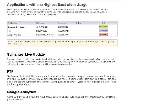
The Application Intelligence and Control feature allows administrators to maintain granular control of applications and users by creating bandwidth management policies based on local pre-defined categories, individual applications, or even users and groups. With the Application Visualization feature, administrators are able to view real-time charts of applications, ingress and egress bandwidth, Websites visited, and all user activity. Administrators are able to adjust network policies based on these critical observations. The Application Usage and Risk Report combines the results of these two features in a downloadable report listing the following categories:
• High Risk Applications in Use
• Top URL Categories in Use
• Applications with the Highest Bandwidth Usage
• Application Usage by Category and Technology
• Top Findings of Network Characteristics
• Recommendations based on the Top Findings
Navigate to the Dashboard > AppFlow Monitor page and click the download PDF report icon from the AppFlow toolbar. The Reports pop-up menu displays. Next, click the Generate Report button to get a dynamically generated report specific to your firewall.
Note The report may take a few minutes to generate and download.
Once the report is generated, an executive summary is provided at the top of the report for a holistic overview of your network. The report contains a real-time snapshot of network traffic to guide you in implementing new bandwidth management policies. An example Application Usage and Risk Analysis report is provided below listing applications with the highest bandwidth usage, their application category, number of sessions, application risk level, and a detailed description of the application.
IPv6 App Flow Monitor
 For complete information on the SonicOS implementation of IPv6, see IPv6.
App Flow Monitor Visualization is configured the same in IPv6 and IPv4, select the View IP Version from the drop-down menu to change the view/configuration.